Friday 30 March 2012

[experiment TWO: the monument] INTIAL AXO + INITIAL S/UP MODELSX2

Below are the two axometric drawings i am taking forward. i have modeled both of these in sketchUP and included them below. before starting sketchup i reread the weeks task sheet and noted that 'some prisms might be subtracted from others'. this helped me develop the designs a little bit in sketchup. some additions have been made to the models compared with the drawings. 

[in the 'depth' model, i created two different rectangles by subtracting the space through two walls whilst in the 'efficient' model i felt more comfortable about seeing all the rectangles as bigger rectangles which i was able to 'carve' down. this led me to overlapping the rectangles more + subtract greater volumes from them. the 'rectangle' that looks like an upside down 'L' with the texture is, i think an example of this; it is almost a different shape but by combining two initial rectangles to form a whole which was then subtracted, alludes to whole shape of a rectangle].


[experiment TWO: the monument] AXOMETRICSX6


Below are the six axometrics and a their reverse angle from this weeks class exercise. i found this exercise hard at first as drawing an axometric was new for me but once i sort of worked to the formula that all lines needed to be parallel to the others on that angle, i found i was drawing some better and more visually interesting drawings. i like how the top 'efficient space' drawing is a little 'bit off' but the reverse view [completed later in the process] looks more aligned.


Saturday 24 March 2012

Animation Two.

Animation Three.


This was the third animation i completed. it shows several sections the structure and rotates around the building in a clockwise motion.

Animation One.


This was the first animation i completed. after watching it back, it seems very quick and the scenes jump too much.

developed design with initial sketch..


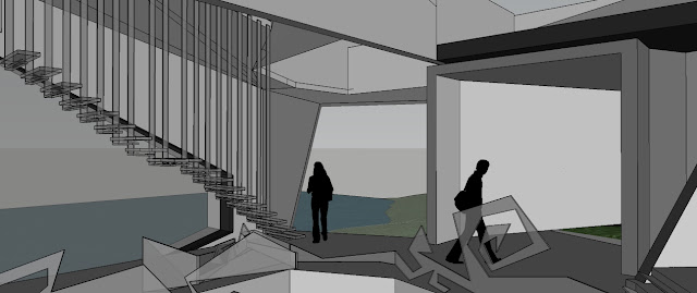
These two images show the 'hanging' stair in the foreground. The top image shows the different viewing zones for the central gallery/ performance space, which can be seen lower than the main floor. the central balustrade is a reflection of the inital sketch i created for the section exercise [which is included below].


The above image shows another angle of the gallery floor. this area forms part of the ampitheatre which allows the public to view the works on display from different heights and angles. the stairs and landings are also wide in this area, hopefully encouraging people to congregate and also enjoy the space as well as the artists work.

The bottom four photos show the exterior of the building whilst the page immediatley below contains the initial section sketch which i developed my design from.


Friday 23 March 2012

more stairs - in situ..

 Above is aquick sketch showing how the stair meets the wall. I propose that where the material meets the wall, the concrete wall is chased, the stair is then slid into place and rests within the channel 100mm. i would then propose the the gap between the concrete and metal is sealed with a construction adhesive, colour to match chased wall. Below shows the initial design sketches.


Here is the stair in situ, before i applied the material texture for coreten.


Above + below show the stairs, rendered with a coreten sample i imported into sketchup. These stairs are now in place within the model and now show the balustrade, [detail below].


Stair, rendered in place from above [below].


Below is an image focusing on the balustrade. i wanted the balustrade to be in total contrast with the stair. unlike the stair, the balustrade is smoothly finished with all rounded edges. i did however choose to keep the material base the same, metal/steel except for this part of the stair i would like to use stainless steel. i chose this contrast, to express the difference between the works of louise bourgerouis; some are sculptures, some are paintings etc.
 

Below is a sketch of some details for the 'hanging' stair. it shows a plan view + two sections. it also gives dimensions for the staircase and shows the detail for how the arm 'hooks' the stair. 

The sketch, two below, shows where the balustrade meets the rest of the building. i would imagine needing an engineer to specify this completely but i am proposing that the balustrades are attached to a metal plate which is formed + fastened within the slab. each balustrade would have a bolt hole the matches the diameter of the hole on the bracket. once the two are alignment, a bolt + washer kit would be used to fasten the hanging stair in place.

The bottom two images show the stairs in situ. i am hoping that they enhance the design intent by appearing to hang or suspend from the ceiling. Defining the inner performance space without closing it off from the rest of the gallery.


materials meet the model.


Above + below are two images of the same material from different angles. The keyword for this patch was 'fluidity'. i chose to use it here as a contrast to the harder lines which the actual geometries create.


Here is another material image. The keyword for this patch was 'corroded'. i am proposing this selection here as i feel it is almost a material representation of the form of the railing it is covering.


The keyword for the above material patch was dense. i wanted to enhance the feeling that part of this part of the building is underground so chose to employ a dense, thick/layered material for the wall coverings.


Above is the initial sketches of the 3 materials i have included in the model.

artist's in their studios..


Above + below are two images of the downstairs studio. This studio has an irregular floor plan, slanting walls, a lower ceiling in one section and  an opening two floors in another. i decided to have an open section and a more conventional section to allow the artist to work on their array of sculptures + and their vast sizes.


Above + below are two images of Stelarc at work in his studio. inspired by his 'performance' art and his suspension pieces, i created a space which is supposed to represent wire/metal twisted/suspended into shape. in line with the 'suspension' idea, i have tried to create a space with no floor.. once stelarc arrives onto his floor and is ready to work, he climbs into the glass and steel structure and hangs himself freely from the architecture. when he is presenting his work, i imagined that he would be able to suspend himself from these heights all the way down to the gallery/performance space.


developing stairs within design..


Above + below are two images in sketchUP of the glass staircase which heads towards the upper studio. There are in total 40 risers in this staircase, so i divided the flights equally into four lots of ten and have platforms proposed to be the same design as the stairs to break up the flights. The arms which 'hook' into the stair [alike some of stelarc in his works], also act as a balustrade and continue the design intent of trying to create stairs that do not cut off the room but tries to define/enclose it. 

WORD: SUSPEND


Above and below are two images of the staircase heading towards the lower studio. Each one of these steps are different to the other. By making the treads wider along the main corridor of the staircase, i was hoping to make it as easy as possible to shift artworks from the studio below to the gallery/performance space above. The irregularity of the stair shape was inspired by the word + of the initial section, [pain].


WORD: PAIN


Wednesday 21 March 2012

video upload - before the dawn..


i chose this video for my blog as an imagined possible precursor for the lower studio of my design. i feel an explosion like the one animated in this video, could possibly influence the distorted shapes i have been working with throughout the experiment. i also feel my key word for that studio [pain] would be deeply felt by the aftershocks of the explosion. often throughout the design process, from the initial sectional sketches with disjointed shapes through to the central 'gallery floor' of the developed design, i thought of an explosion and i feel the placement of certain elements in the design are a reflection of that; the central floor [gallery floor] is at the centre of the structure. in an explosion, the most energy is at the centre so i feel this notion lends itself nicely to the building in that the gallery floor is where the artworks are viewed and design wise this is the area with the most energy..

Tuesday 20 March 2012

from paper to the screen..

 Above is a quick hand sketch i did before i began the more developed model i am working towards for the submission. after drawing the initial section during exercise 1 and putting it into sketchUP last week, i wanted to try and give myself a clearer picture of where i was headed when i went into sketchUP this time. i began with the sketch, trying to emulate the lines i had created in the sections and then put this into sketchUP this week [initial progress below].


Friday 16 March 2012