
Wednesday 20 June 2012
Tuesday 19 June 2012
[experiment III: the bridge] final post II - capturedVIBE
Above iv included the youtube link of an animation i made for experiment III:the bridge. the animation gives an overview of the both HQ's starting with FB the T2. it then shows the elevators in action + the valley floor wih table. the animation ends with our execs leaving the site via helicopter having 'captured the vibe'.
ENJOY.
[when i uploaded the animation to youtube it skews when watched in small screen. please enlarge to full screen to eliminate this problem].
[experiment III: the bridge] final post I

Above is the image of the Blue Mountains National Park i used to create my terrain.

Above is overall image of the FB HQ. this is the largest area within the entire structure + is a reference to how FB continually buys everything up + seemingly overpowers smaller companies into takeovers [in this case the FB HQ is above the other smaller HQ].

Above + below are two further images of the FB HQ. these images show the 'separated' but interconnected thought behind the HQ's design. i wanted to capture the networking element of FB so incorporated a single interior form which from the outside look like separate areas.


Above + below are two images of the T2 HQ. The top image shows how two form interact with each other to create the one [different forms shown by different textures]. this was definitely a design choice because i wanted to show some interconnectivity within this form as an expression of the interactive principles of T2.

i think that both FB + T2 lent themselves to each other well in the design process. i found that whilst i wanted both to be distinct, i realised that some of the core ideas may be re-expressed within the other HQ - especially the core concepts of networking for FB + interactivity for T2. i think this gives the entire a site a balance + allows each side of the bridge to compliment the other.
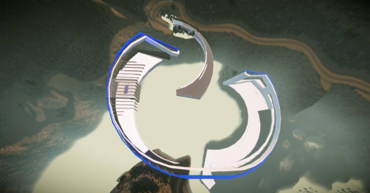
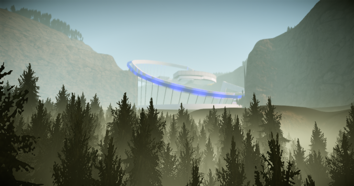
Above + below are two images of the site overall. the top one shows how the entire site relates to other whilst the one below shows the structured nestled into the terrain.

The FB elevator. the front platform that appears grey is where the T2 platform joins this elevator + become one for the final descent.
The below four images are of the valley space + the power table. both areas reincorporate elements already introduced in the site. the entire valley structure is a continuation of the top arch in the bridge. the table then uses this element albeit on a much smaller scale.


[Please check out my post 'capturedVIBE' for animation of this experiment].
[experiment III:the bridge] link to cE3 environment
included here is the link to my terrain in the editor:
http://www.gamefront.com/files/21872236/Best+E3.1.rar
when in the terrain, the controls are:
FB elevator - forward = o/reverse = p
T2 elevator - forward = i/reverse = l
[to ensure elevators meet at right time, press i 6 seconds after o].
when in the terrain, the controls are:
FB elevator - forward = o/reverse = p
T2 elevator - forward = i/reverse = l
[to ensure elevators meet at right time, press i 6 seconds after o].
[experiment III: the bridge] link to model in sketchUP warehouse
Above is the link to my model in sketchUP warehouse
Sunday 10 June 2012
[experiment III:the bridge] movin models - textures

Above + below are two images showing my three selected images within the model. of all the textures, i think the simplist texture, has had the best effect. at different depths of view, the 'dotted' material appears to change color + texture. the other textures are a rigid + scalor texture; both on the facades of each HQ.

[experiment III: the bridge] elevators 2

After having done the initial elevator a few days ago, i kept thinking it had nothing to do with my overall design scheme. i erased the bits that really didnt seem to go and repeated the overall form of the bridge arm as the elevator 'cage' [seen above + below].

Thursday 7 June 2012
[experiment III: the bridge] the elevators in sketchUP before export..

Above is an image of both the elevators facing each other. Together they are metaphors for their respective companies. The T2 elevator on the right interacts with the Facebook elevator by shooting out of the T2 HQ into the other lift whilst the FB elevator 'swallows' the smaller elevator when they collide. The T2 elevator flies into the FB elevator. This interaction sends both elevators now morphed as one, towards the valley below.

Above + below are some images of the elevators morphed - interacting but the larger dominating the smaller.

Wednesday 6 June 2012
[experiment III: the bridge] week three

Above is an image of the T2 HQ a little further along. From this vantage point we can see the two openings in the floor plane which help to recreate one of my key images for T2 [seen further down post].

Above + below are two images of a staircase in T2 HQ. The design was initially design for this not HQ [not F/Book] with the idea of 'interaction'. The staircase is actually two completely seperate staircases which combine to become one. i would like this interactivity to be metaphor for T2 INTERACTIVE and how their games may begin to impact our reality.

[Although highly illegal i guess, i didnt include an actual balustrade here. the balustrade is the 600mm of double height steps on the right hand side and the other side of the stair is enclosed by the wall. i was hoping that that the double height step would act as a deterrant and therefore keep people far enough back from the edge. but understandably highly illegal in the real world.]

This image shows one of the glazed openings in the T2 HQ. Along the far edge of the glazing, there is an outline for a proposed bench seat, more detail to follow.
the main element i want to capture with this image is demonstrated in the image below. the image below is a screenshot from a Rockstar [T2] game. By recreating this in the HQ, i wanted to give the T2 staff an oppurtunity to be 'within' their game from another angle, not just from the otherside of a computer screen but actually within - the true nature of interactive[ity].


Iv spent most time this week on the FBOOK HQ [above]. i have broken the elements of the building up but left them all interconnected through the interior. this is a metaphor for the networking side of Facebook + the core of its existence. this is why there are several different elements to this HQ rather than the more direct approach of the T2 HQ. the centre of this HQ continues this theme and is broken up with huge pillars around a glazed 'box'. this signifies the tight control MZ has [had] over FBook - everything was interconnected but all decisions were made centrally.
Below is a quick image from the FBOOK HQ.. in the distance we can see the proposed T2 HQ and the meeting space on the valley floor.


finally, iv started to map out the structure on the valley floor. this is very basic at this stage + will continue over the next few days.
Monday 28 May 2012
[experiment III: the bridge] week two

this week iv started to think more about the structure + the site as a whole. in these images have refined the take 2 HQ + started to map out how the structure will look overall.


the above image shows the 'take 2' HQ inthe foreground + the platform where the 'facebook' HQ will be situated.
below is some further development..

some further work on the site overall. each structure [facebook HQ + the 'boardroom'] are supported by the main element of the design. after the elevators morph into one, it will also use the arm the carry people between the valley peaks + floor.

an overhead view of both the HQ's. t2 on the left + facebook barely taking shape on the right.

an interior image of the t2 HQ. this view is from a raised platform which will be over the elevator exit point. this area will have a glass floor + will mimic one of the key images i found for take two interactive - to be updated soon.

this image shows the interior of the facebook structure without the roof plane and the top floor plane. it is substantially larger than the other HQ and will include specific details relating to the original images i found.
[experiment III: the bridge] week one
this was a slow one.. after initially putting a few basic ideas into sketchUP for importing into the sandbox, i ran into a heap of trouble this week. i had unknowingly changed a file path for exportation which seemingly took an age to sort and slowed other progress this week.
below are some images of the model i have been working on in sketchUP.


below are some images of the model i have been working on in sketchUP.

in the above picture, i began by multiplying my original form + rotating it whilst also enlarging its scale. these two pieces became the opposing sides of the bridge. i did this for two reasons; firstly as a symbol of power. in the image it looks as though the larger 'arm' is protecting the smaller one, which it is also supporting.
the larger arm will house the 'facebook' HQ whilst the smaller arm will feature the 'take 2 interactive' HQ. in the model when directly above the site, both the curves relate to each other and appear to be a flat path between the valley. this interaction between the two sides of the bridge is a subtle reference the nature of where 'take 2's' games take us now and the possibilities in the future - [appearing like a path].
i am trying to create both structures as if they have taken over a bridge. whilst the bridge will not join + therefore is impossible to travel from side to the other, i want the HQ's to look as if they have grown out from the bridge itself. coming from within + on top of the road ways etc.
[the white rectangular shape is not part of the design but just a guide for the site].

the take 2 HQ. the elevator release section is on the right hand side of this image.

the inner wall of the take 2 HQ.

take 2 from above, wk1.
[experiment III: the bridge] starting point

After deciding to use 'facebook' + 'take 2 interactive' as my clients for this project, i began to search for images relating to each of those two + bridges that resonated with me. i narrowed my image search down to the 14 images above + decided that these were some keys ideas i wanted to explore in relation to my structure. i am now wanting to use these images as a platform into my design.
[experiment III: the bridge] the movin' 36

Above is a poster of my 36 movement textures + below i have included the textures i am applying first to my model.
[they have been cleaned up in photoshop so they are crisper in the sandbox].
 |
| Texture one: DIRECT |
 |
| Texture two: SCALOR |
 |
| Texture three: RIDGID |
[experiment III: the bridge] a dozen + a half more...

row one: captured/held/escape
row two: marked/impacted/stomped
row three: protected/bounding/strong

row one: definite/permanent/clear
row two: bonded/solid/held
row three: dominating/stealth/developed
Tuesday 15 May 2012
[experiment III - the bridge] Jamison Valley, NSW.
I have chosen to model Jamison Valley in NSW for the my terrain. i chose this area because it is a place i visit often + has several distinguishing features, namly Mt. Solitude + the '3 Sisters'.


The 3 Sisters

Mt. Solitude

[above + below] Jamison Valley incl. the 3 Sisters + Mt Solitude in the picture below.

Subscribe to:
Posts (Atom)