Andrew Best
Wednesday, 20 June 2012
Tuesday, 19 June 2012
[experiment III: the bridge] final post II - capturedVIBE
Above iv included the youtube link of an animation i made for experiment III:the bridge. the animation gives an overview of the both HQ's starting with FB the T2. it then shows the elevators in action + the valley floor wih table. the animation ends with our execs leaving the site via helicopter having 'captured the vibe'.
ENJOY.
[when i uploaded the animation to youtube it skews when watched in small screen. please enlarge to full screen to eliminate this problem].
[experiment III: the bridge] final post I
Above is the image of the Blue Mountains National Park i used to create my terrain.
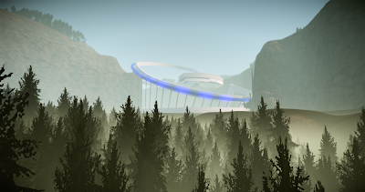
Above is overall image of the FB HQ. this is the largest area within the entire structure + is a reference to how FB continually buys everything up + seemingly overpowers smaller companies into takeovers [in this case the FB HQ is above the other smaller HQ].
Above + below are two further images of the FB HQ. these images show the 'separated' but interconnected thought behind the HQ's design. i wanted to capture the networking element of FB so incorporated a single interior form which from the outside look like separate areas.
Above + below are two images of the T2 HQ. The top image shows how two form interact with each other to create the one [different forms shown by different textures]. this was definitely a design choice because i wanted to show some interconnectivity within this form as an expression of the interactive principles of T2.
i think that both FB + T2 lent themselves to each other well in the design process. i found that whilst i wanted both to be distinct, i realised that some of the core ideas may be re-expressed within the other HQ - especially the core concepts of networking for FB + interactivity for T2. i think this gives the entire a site a balance + allows each side of the bridge to compliment the other.
Above + below are two images of the site overall. the top one shows how the entire site relates to other whilst the one below shows the structured nestled into the terrain.
The FB elevator. the front platform that appears grey is where the T2 platform joins this elevator + become one for the final descent.
The below four images are of the valley space + the power table. both areas reincorporate elements already introduced in the site. the entire valley structure is a continuation of the top arch in the bridge. the table then uses this element albeit on a much smaller scale.
[Please check out my post 'capturedVIBE' for animation of this experiment].
[experiment III:the bridge] link to cE3 environment
included here is the link to my terrain in the editor:
http://www.gamefront.com/files/21872236/Best+E3.1.rar
when in the terrain, the controls are:
FB elevator - forward = o/reverse = p
T2 elevator - forward = i/reverse = l
[to ensure elevators meet at right time, press i 6 seconds after o].
when in the terrain, the controls are:
FB elevator - forward = o/reverse = p
T2 elevator - forward = i/reverse = l
[to ensure elevators meet at right time, press i 6 seconds after o].
[experiment III: the bridge] link to model in sketchUP warehouse
Above is the link to my model in sketchUP warehouse
Sunday, 10 June 2012
[experiment III:the bridge] movin models - textures
Above + below are two images showing my three selected images within the model. of all the textures, i think the simplist texture, has had the best effect. at different depths of view, the 'dotted' material appears to change color + texture. the other textures are a rigid + scalor texture; both on the facades of each HQ.
[experiment III: the bridge] elevators 2
After having done the initial elevator a few days ago, i kept thinking it had nothing to do with my overall design scheme. i erased the bits that really didnt seem to go and repeated the overall form of the bridge arm as the elevator 'cage' [seen above + below].
Subscribe to:
Comments (Atom)


